Launching a baby registry app
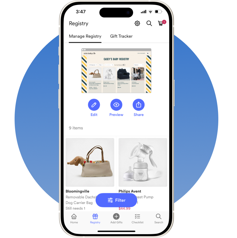
The Goal
Create and launch an MVP of a baby registry app experience for expecting parents and a web shopping experience for gift givers.
My Role
Lead design from start to finish for Zola baby. Collab with other designers, tech, product, marketing and merch to execute.
Building a foundation from Zola's best-in-class weddings app
Zola's original business is a one-stop-shop for planning your wedding. It is a platform that allows couples to create a registry, search for vendors, build a guest list, order invites, budget for their big day, and more.
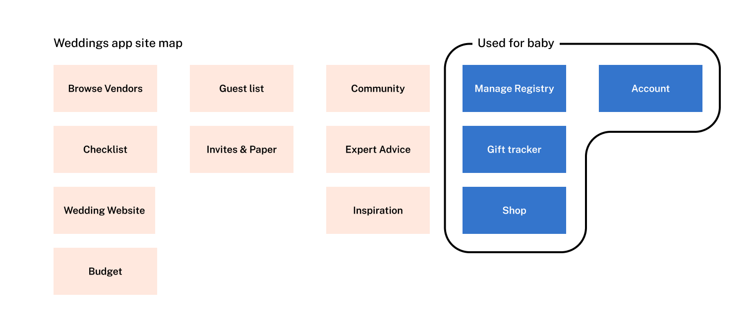
For the baby product, we aimed to leverage as much of the existing wedding registry app as possible to keep the scope low. As a first step, we conducted an audit of all the screens in the weddings app that might be re-used.
Using prototypes to drive product requirements
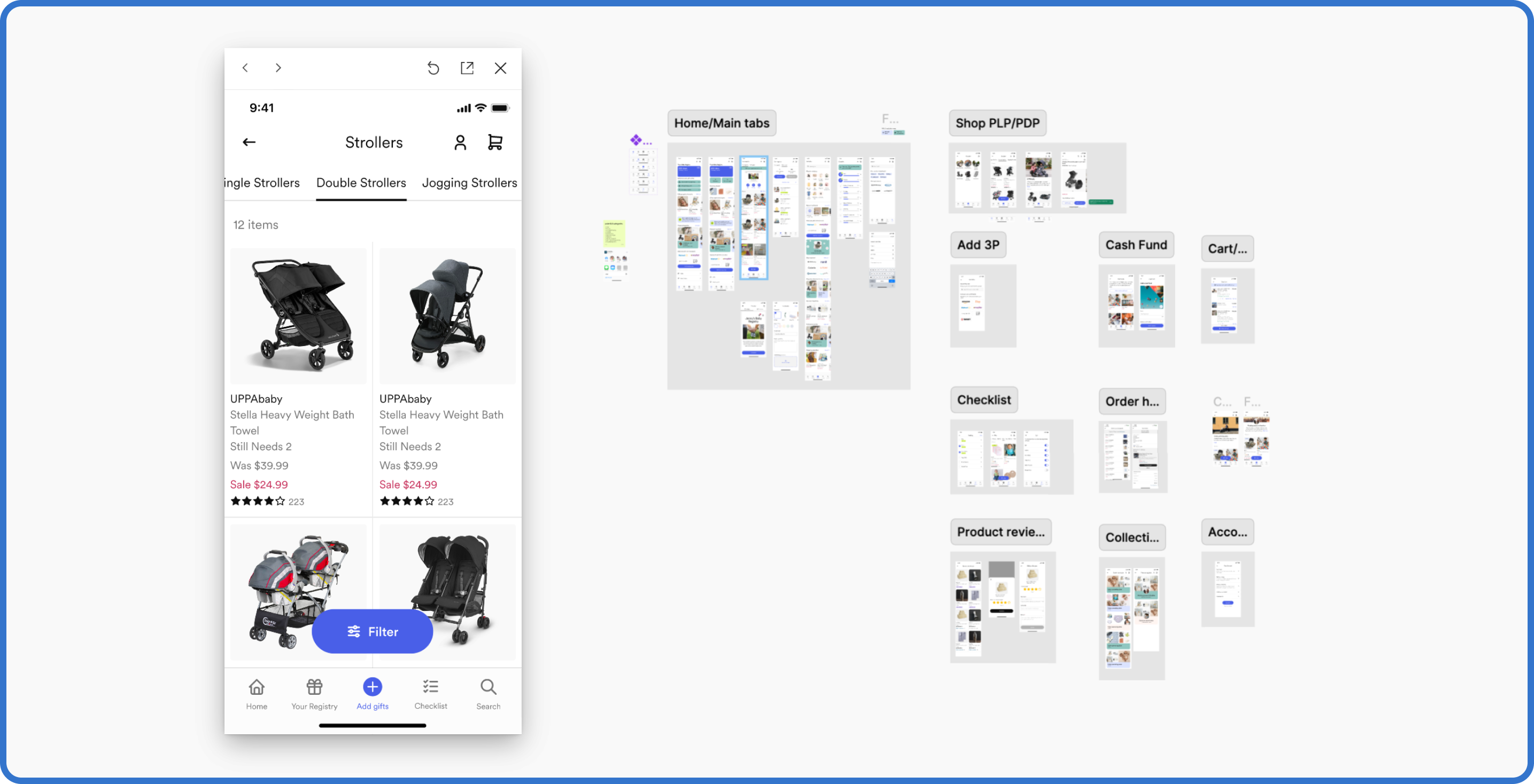
Instead of waiting for a project document, we immediately started building a prototype from the relevant wedding screens. We noted where changes would be necessary for Zola Baby and used our prototype to facilitate discussions with the entire team regarding tech requirements, creative implications, merch contracts, and more.
Some screens stayed almost exactly the same between apps
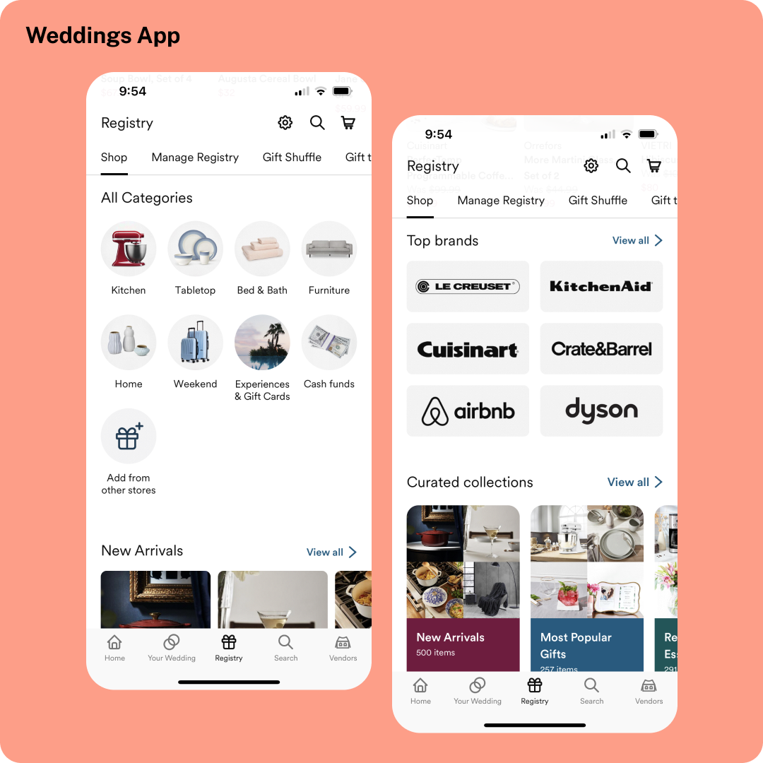
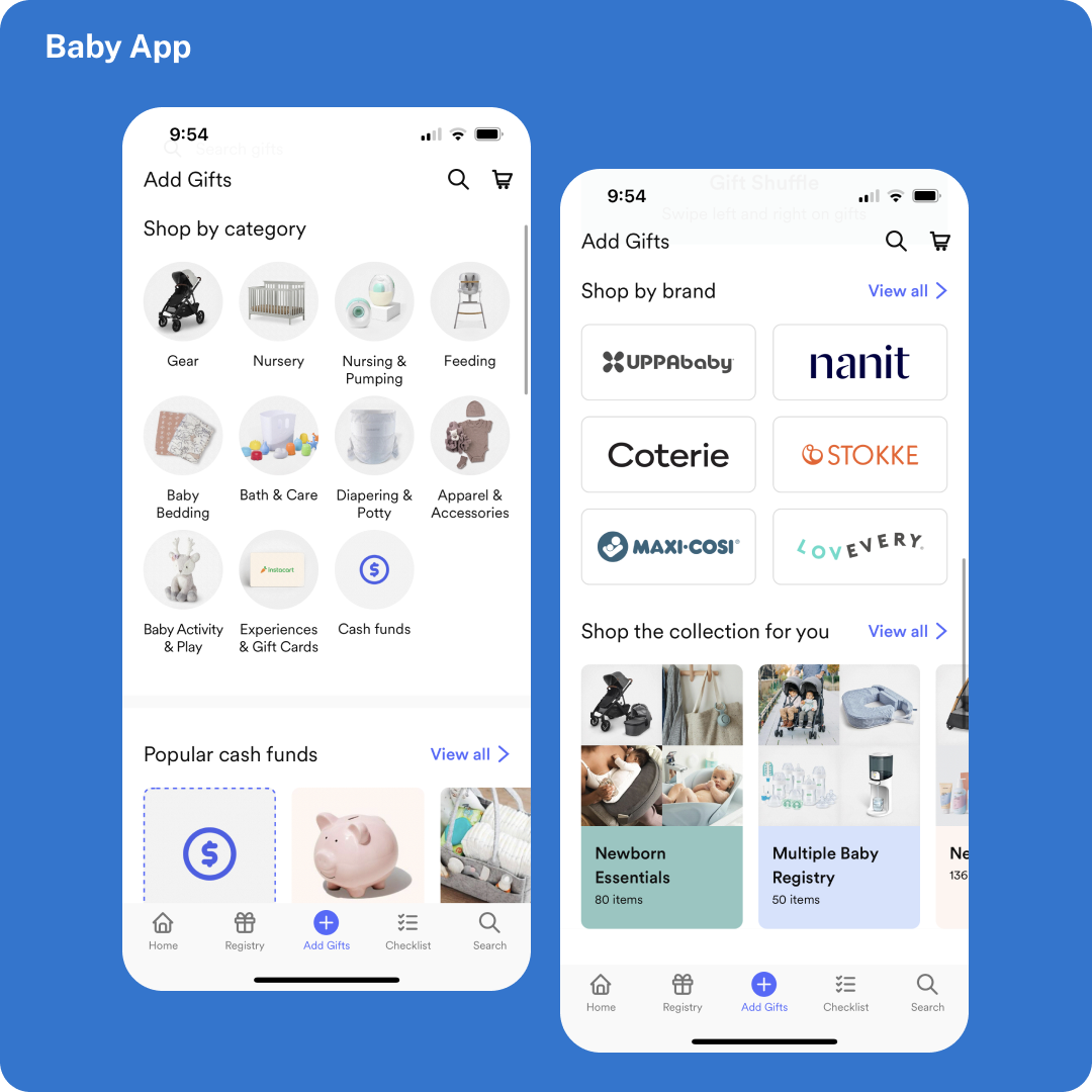
While others got some baby-centric upgrades
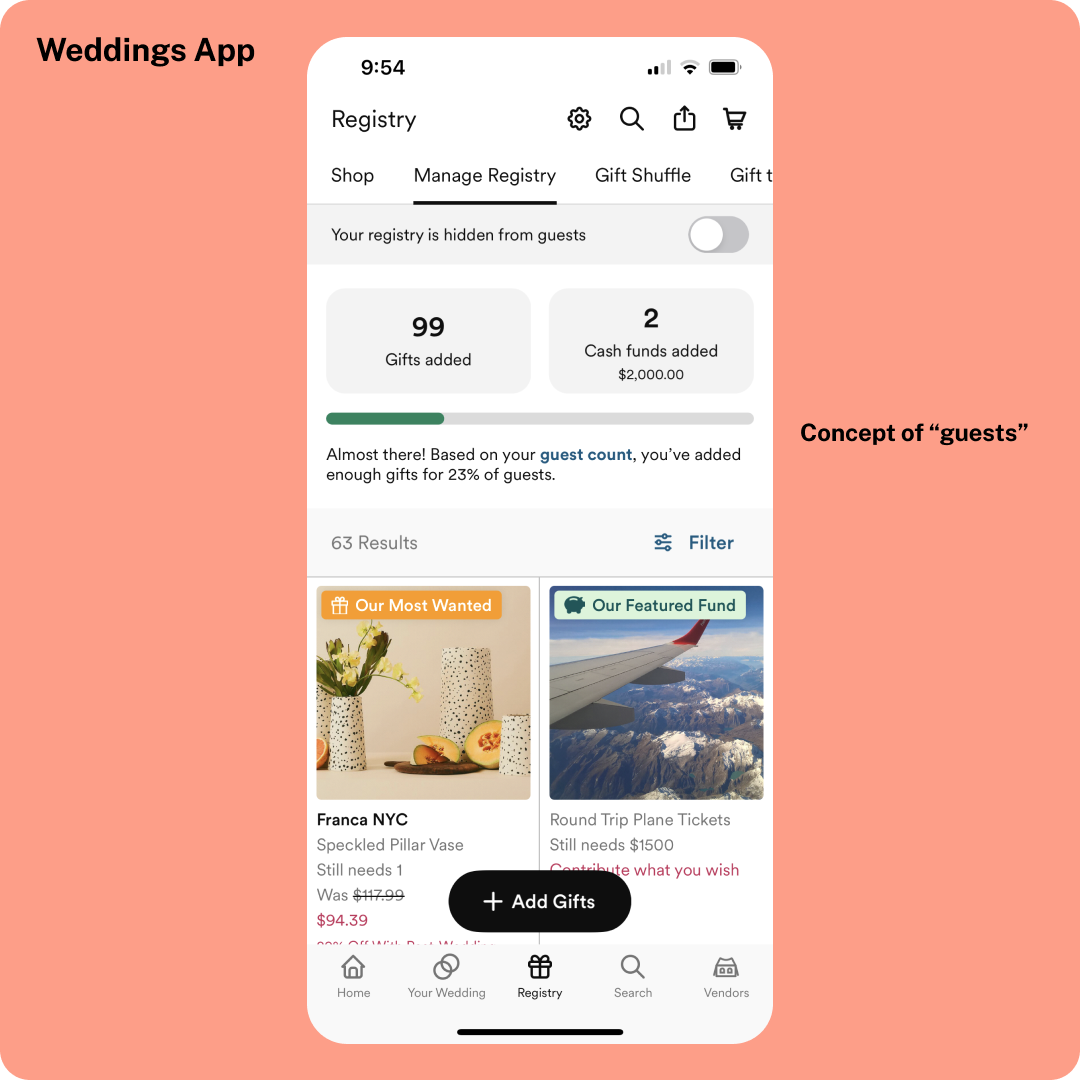
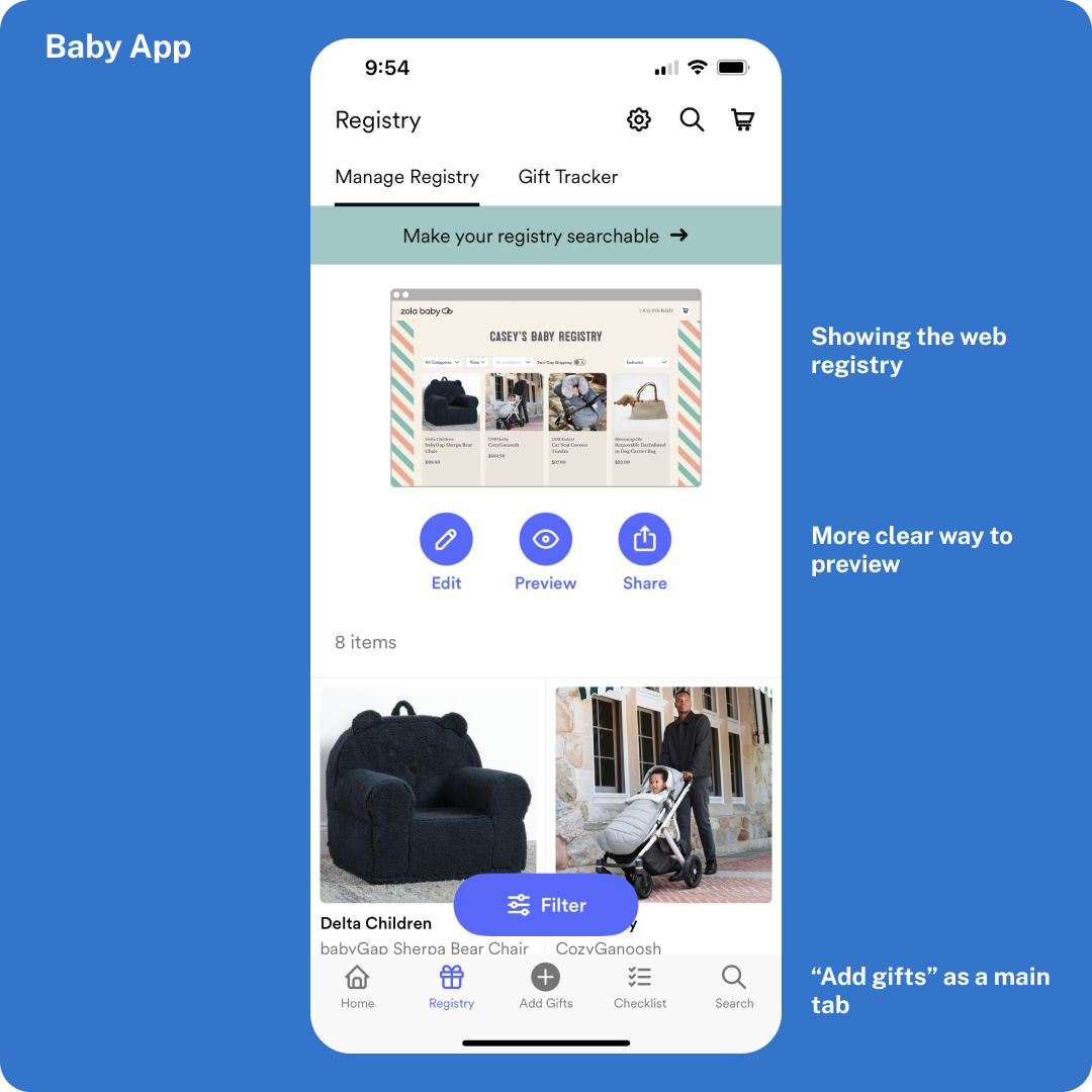
Getting in the baby mindset
Both getting married and starting a family can be incredibly emotional life moments. As designers, it's crucial to be mindful of the user's state of mind. While it wasn't within our project's scope to conduct much formal user research, we talked with coworkers and friends to identify key principles we needed to consider when switching context from Zola Weddings to Zola Baby.
New parents want guidance
For a wedding registry, most users already have specific gifts in mind, like an upgraded vacuum or a coveted Dutch oven. However, expecting parents, especially first-time parents, might have no idea where to start with their baby registry and seek guidance.
While we didn't have the resources to build an extensive backlog of expert advice content, we embraced the concept of guidance by creating a customizable registry checklist. This checklist helped parents identify which items were essential for their journey into parenthood.
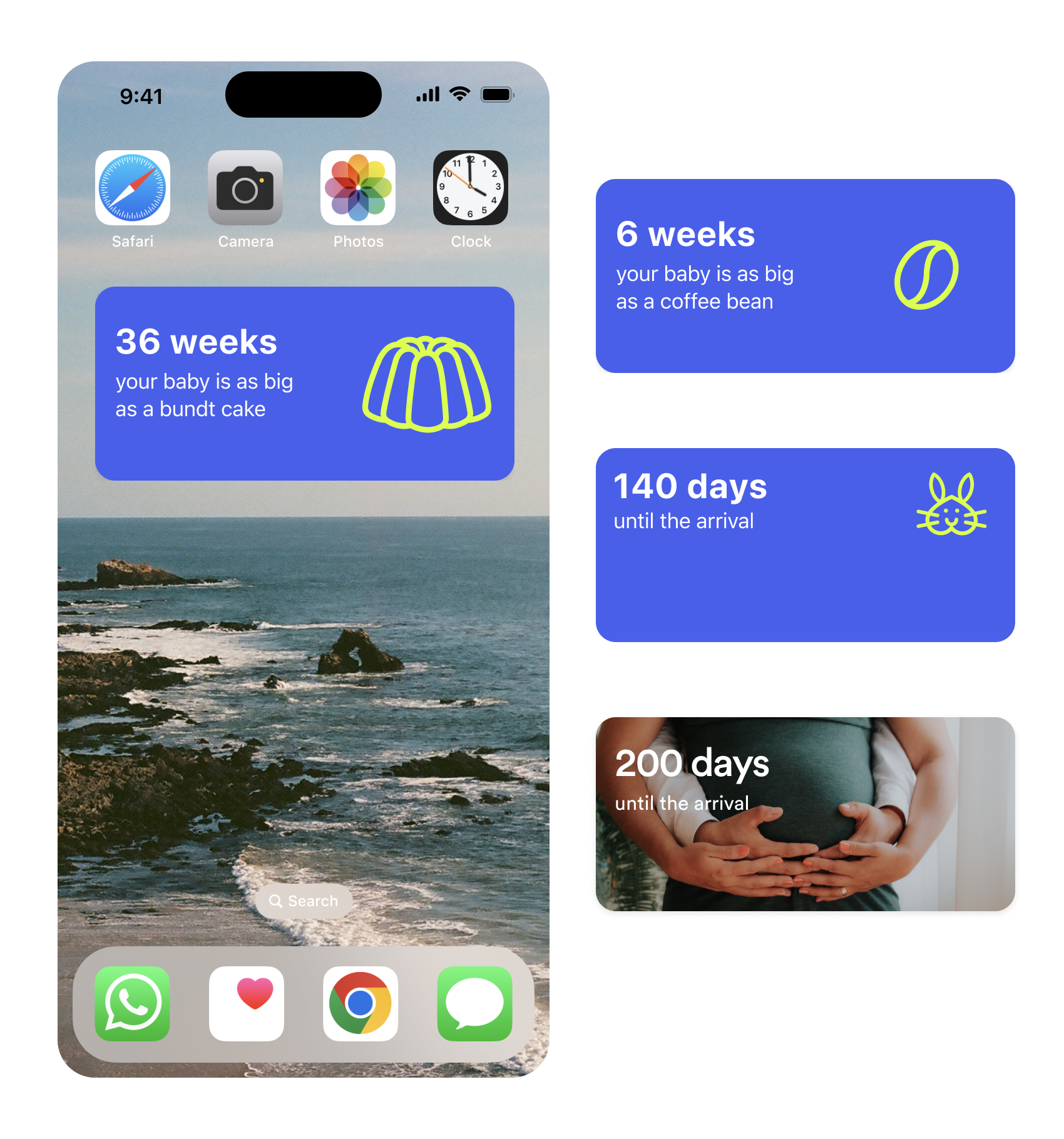
Variation of our iOS widgets
Many parents we spoke to loved the novelty of other apps that allowed them to track their baby's size on a weekly basis. However, we understood that not all parents were interested in this feature, and not all were tracking a growing baby; some were on other paths to parenthood. We created multiple versions of our iOS home screen widget for parents to choose from.
Utilizing existing website themes to let parents personalize their registry
The Zola Weddings experience offers hundreds of wedding website designs for couples to choose from. With Zola Baby, we curated a select handful of those themes for users to choose from.
General UX improvements
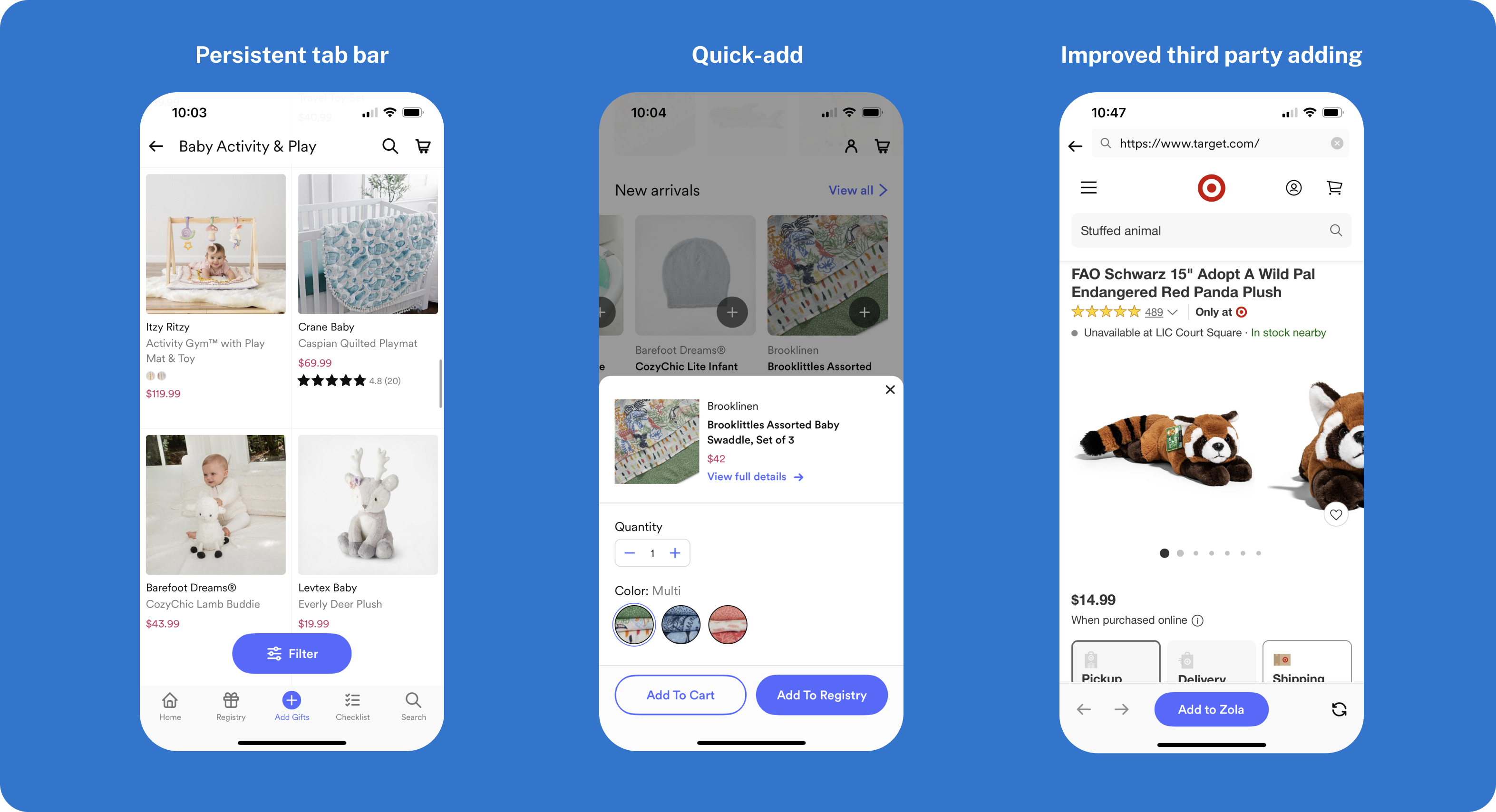
Introducing a new app into the Zola universe prompted us to make some long-awaited UX improvements. This included maintaining a persistent bottom tab bar across pages, implementing the ability to quickly add gifts from specific screens, and enhancing our third-party gift adding experience significantly.
Zola Baby's web presence
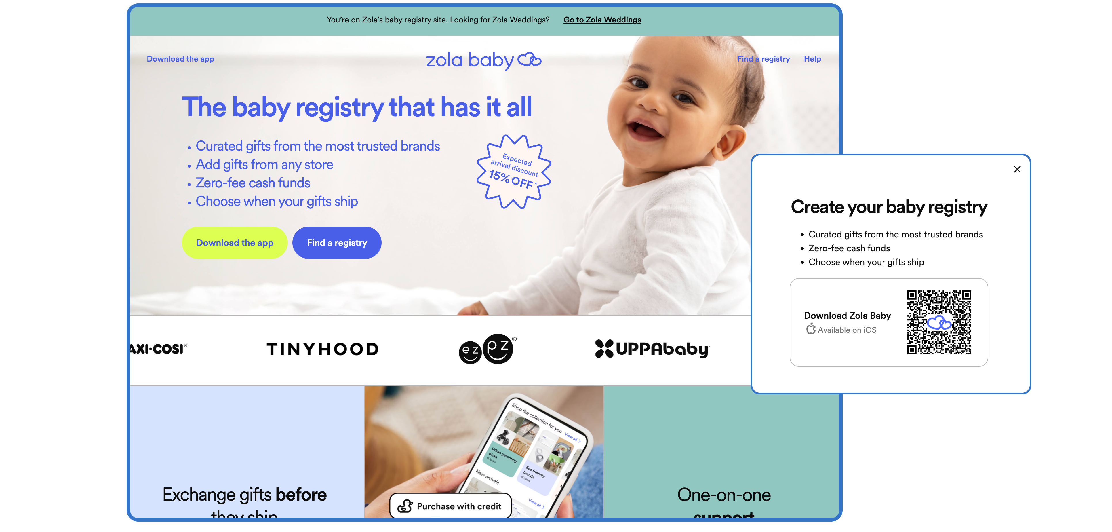
Along with the users' public-facing registry pages, we created an informational landing page for Zola Baby on the web. From this page visitors could download our app or search for a registry.
Working with the creative team to pressure test new branding
The creative team worked in parallel with us to craft a distinct brand for Zola Baby. We collaborated closely with them to test various color palettes in the app and make sure that their choices were accessible.

Launching Zola Baby
In the first month after launch we saw thousands of registries being created by couples who had used Zola for their wedding. More results coming soon!
Impact
The launch of our baby registry product, allowed Zola to break into a new market and continue to provide value to couples after the wedding day. In the first month, we saw thousands of Zola Weddings couples create and use our baby regsitries.