Designing a more scalable and effective home screen
The Goal
Increase the discoverability of new features and the scalability of our home page
My Role
Lead the design process, create and execute user testing plan, collaborate with tech, copy and product teams.
The problem
Our old navigation had a jump menu with space for 8 products. This menu got a lot of action from users but had a limited number of spots. Therefore, every time we introduced a new feature, we would have to debate which items stayed and which went. We also found that no matter what we tested putting below the jump menu, no one interacted with it meaningfully.
Getting in the user's mindset with a card sort activity
Internally, we had lots of ideas about how the ecosystem of Zola products might be organized but it was important for us to leave our own biases aside and understand how users would organize them.
We set up a card sort activity to do with 6 real Zola users who were in the midst of wedding planning. We presented users with a pile of cards, each reflecting a different product or page in the Zola app and asked them to group the cards however made sense to them. After a user had grouped the cards how they saw fit, we would often ask them to consolidate down to 4 or 5 groups. Interviews were executed via Zoom.
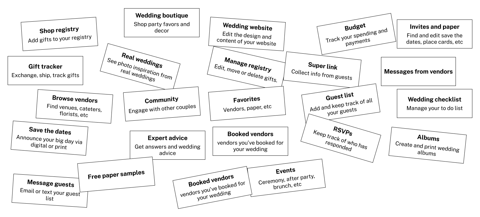
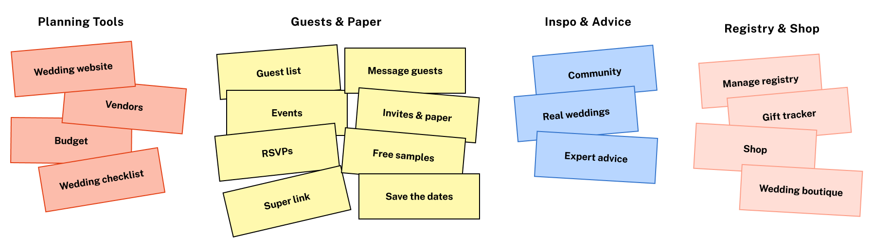
Takeaways from card sorting
Inspiration 💡
Every person we interviewed created some sort of Inspiration grouping that included Community, Real Weddings and Expert Advice. This was also a theme we saw in interviews for other projects.
"I’m going there to engage with people or seek outside inspiration"
Guests 💌
When forced to consolidate groups, many people combined either paper or website with the rest of the guest list tools.
"The guest group is like who you have and how you communicate with them"
"Put the paper samples, invites and save the dates with all this guest stuff sort of make that all go hand in hand"
Planning Tools 🧰
Many participants grouped together things that felt like their personal to-dos.
"That all seems to be things you're doing to keep track of your wedding holistically on Zola"
"Something that I feel like I'll continue to check in on"
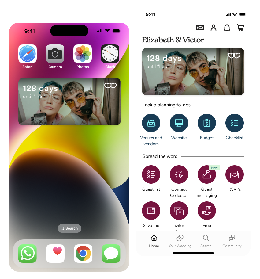
From our interviews, we identified 4 main groups to start with. We planned to put this new grouping in a prototype and guage reactions in another round of testing.
Prototypes for testing
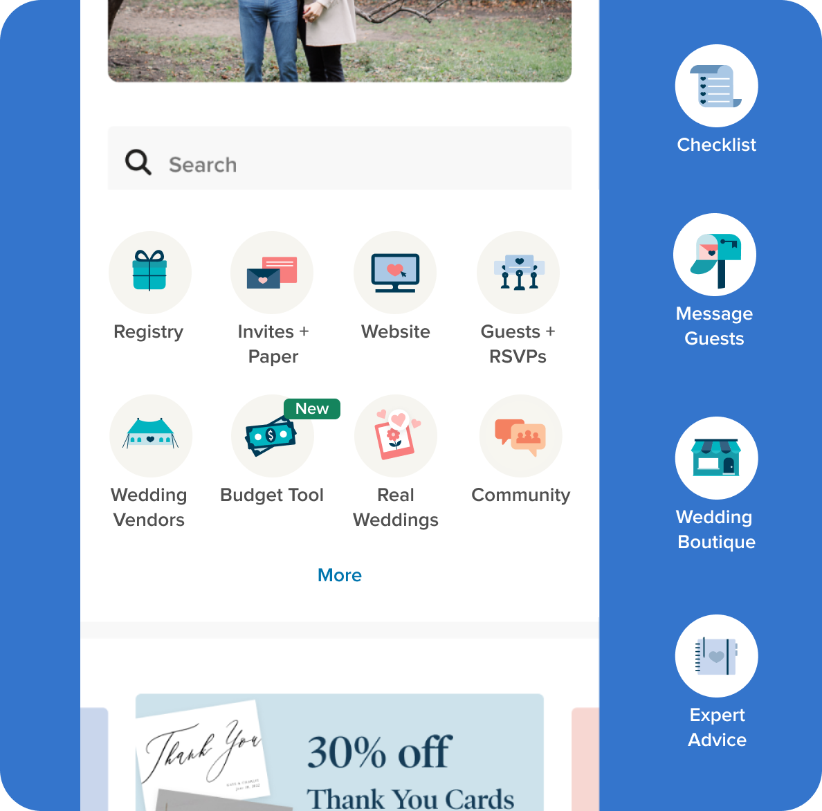
When translating the groupings from our card sort into designs that we could put in front of users, we had two solutions in mind. One that continued to use the home page as navigation but in an even bigger way and a second that used sheets to expand each section in the bottom bar.
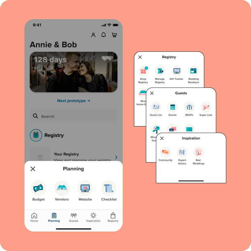
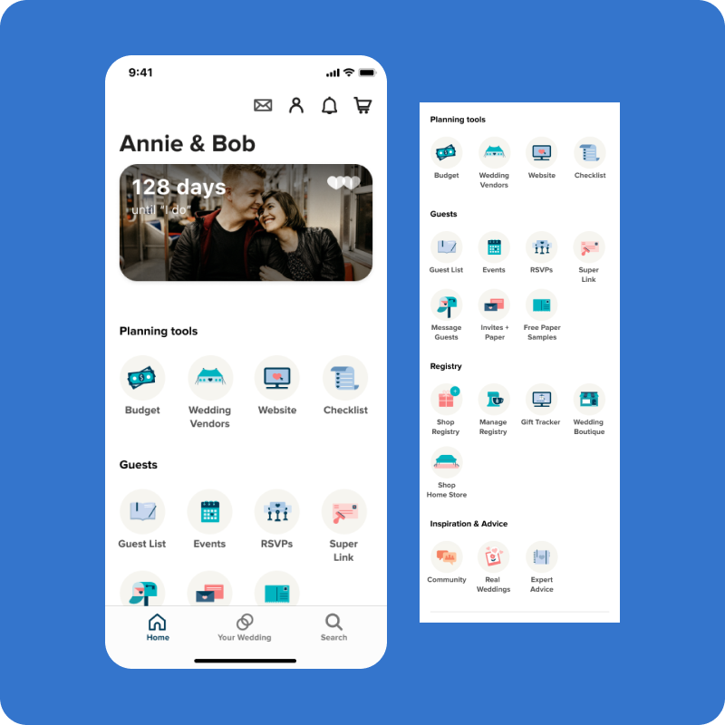
4 out of 5 of the users preferred the giant jump menu option because they liked having a high level view of all of the things they could do on Zola. Most couples are not experienced wedding planners and seeing everything, helped them think about all the things they might need to do for their wedding.
Refining designs and applying new branding
At the same time that I was working on this project, Zola was getting ready to roll out new branding. We decided that this project would be the first that we would execute in the new style. In parallel, we worked on updating the branding across all of our components and pages.
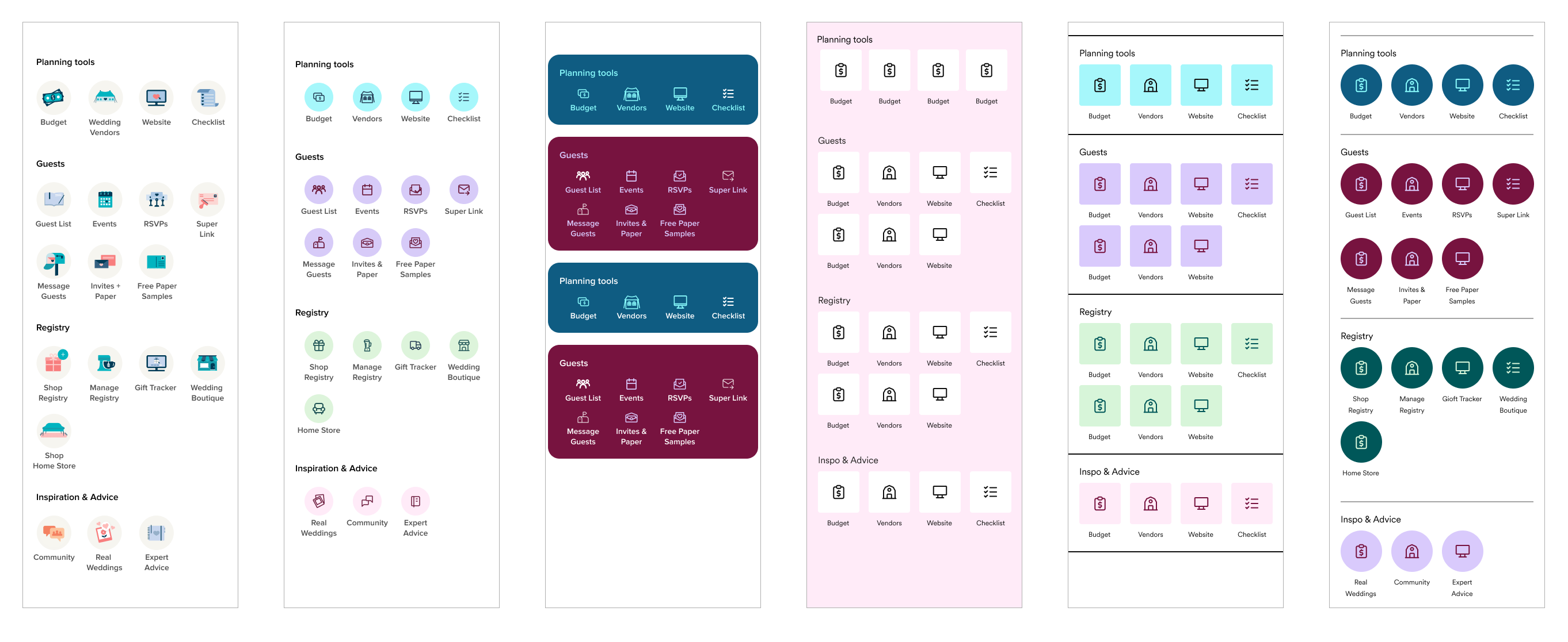
For our final iteration of the nav links themselves, we decided to use our new brand colors to separate the sections. We worked with the copy team to create titles for each section and link.
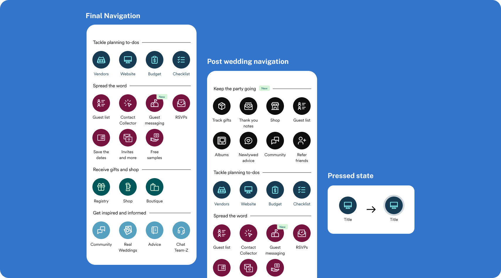
Interaction
I also wanted to put more thought into the tapped states of the jump menu links. In our previous menu, the text changed colors when tapped. However, the change was not very noticeable when the user's finger was covering most of the icon and text. I worked on multiple iterations where the change could still be seen behind a finger.
Designing into the rest of the page
After we felt good about the nav links and bottom bar, we turned our attention to the rest of the home page. The previous page included a lot of marketing, education and other modules that got little to no interaction.
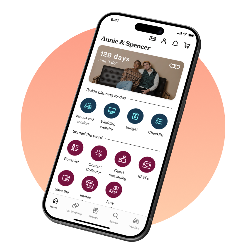
In the old version of the home page, we allowed users to upload a photo, but it was not very clear what the photo was connected to. For our new home page, we wanted to highlight our wedding countdown widget in that space. This would encourage couples to add a wedding date, get them familiar with the widget and personalize the home page.
The final product
Impact
Improve Scalability
This design solution increased the number of links that we could fit on our home page. With this new design, users were also more likely to scroll all the way to the bottom of the home page.
Increase performance
Our main KPI was to increase the number of users signing up for more than 2 products in the first 7 days and we saw that number increase by 7%.
Enhance Adoption
Secondarily, we saw clicks and time spent in the first session increase significantly.