Making a great first impression with onboarding
The Goal
Because our onboarding flow already had a pretty high conversion rate, our main goal with the redesign was to create a great first impression on couples downloading the app by modernizing and rebranding the flow.
My Role
My role was to own the design process from start to finish and to collaborate with copy, product and tech teams to come to a final solution.
Taking time to add some delight
I had initially chosen to work on this project for a design hackathon. Because I was creating new accounts often to test new features in the app, I was going through the onboarding flow more often than any user ever would… and it was slow. The chatbot UX seemed outdated and waiting for "Melissa" to "type" a response slowed down the sign up process a lot. As we introduced new branding, this experience became even more disjointed from the rest of the UI. I wanted to spend some hackathon time thinking about how to add a bit of personality and sparkle to our design system since it's not always something we make time for with day-to-day projects.
Aligning on the flow
The first thing I did was assess the questions that currently existed in the flow and their order. I worked with the web designer to understand how we could create more consistency between the two flows.
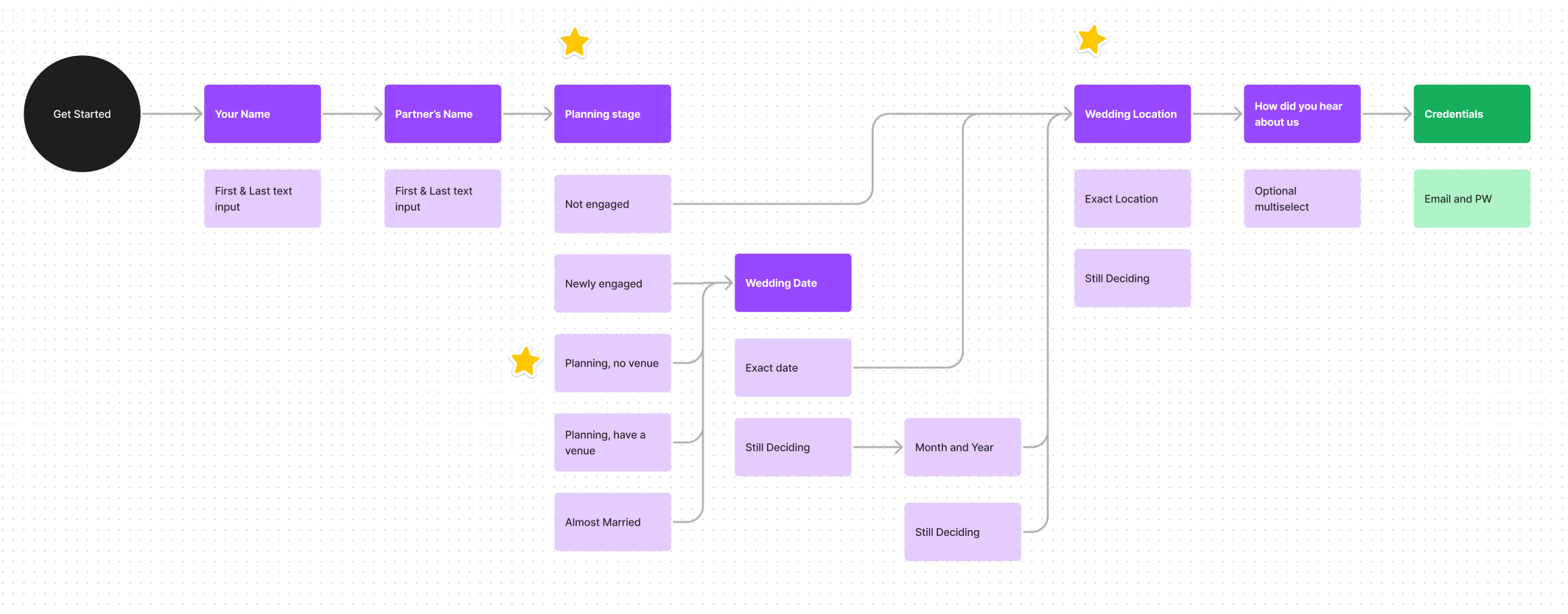
We didn't make massive changes to the existing questions. We ended up adding one new question about what stage of planning the couple was in. We did not previously ask this question in the app, but it would help us customize the user experiencea cross platforms. We were able to combine this with an existing question about venues to keep the flow short.
Bringing it to life with our new branding
Zola was in the midst of a rebrand when I worked on this project and we were still figuring out exactly how the brand came to life in the product. I explored multiple visual directions that I thought would work with our new style guide.
Exploration A: Using Imagery
In marketing channels, our new brand came to life with lots of photography and not much graphic design or illustration. After trying to incorporate imagery in these screens, we decided that it would not be very scalable for the future and it was also difficult to make images of random couples feel personal to the new user.
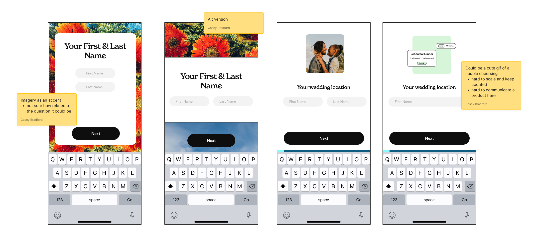
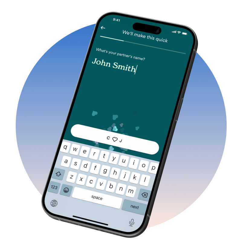
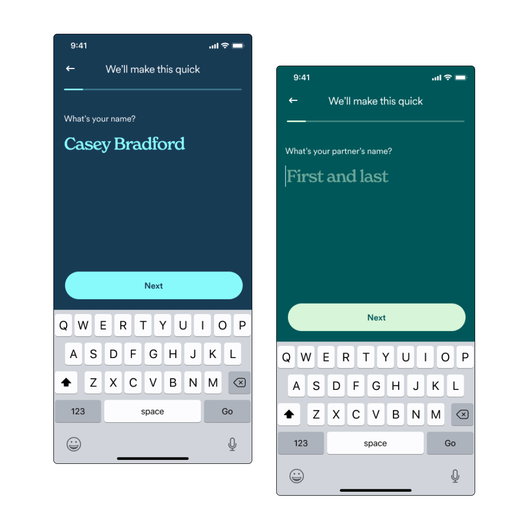
Exploration B: Graphic form fields
I looked at some other apps and websites that got playful with the design of certain form fields. I liked the idea of adding some brand personality while also allowing the user’s input to be the star. Focusing on one question at a time minimizes the perceived effort of onboarding and is a regular pattern on iOS apps. The full page form fields felt modern, easy, and allowed us to play with our new brand colors.
Refining the interaction
Simple user feedback
It was important for us to show the user that each response was tailoring their Zola experience. However, we did not want the feedback to massively slow down the process like it had been with the chat bot. For key questions in the flow, we animated the button to have a bit of personalized feedback before the screen changed over. I worked closely with the copy team to decide which questions would have feedback and what the text would be.
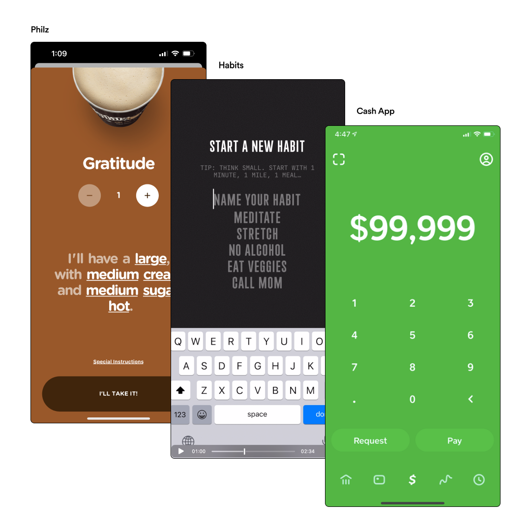
Slick transitions between screens
We also wanted to have slick transitions between questions to keep the flow moving. We explored many options, a few shown to the right, but ulitmately desicded to stick something simple - animating the questions in from right to left and keeping the button in place.
Prioritizing an emotional experience can have a large imapct
Even though our main goal with this project was not tied to a specific KPI, after launch we saw a huge increase in users completing the onboarding on their first session with the app. This means that couples are abandoning the flow less and they are getting into the app and Zola products faster.